Fifteen point nine seven kilometres. One thousand and forty-eight metres of gain. An average of 6.6 percent from Bourg-d'Oisans to the summit at 1,820 metres, with a published maximum near 13 percent on the early ramps. Those are the numbers a vintage poster of Alpe d'Huez is trying, in one way or another, to represent. Whether it earns wall space depends less on the illustrator's line weight and more on who is buying it and why. Rather than answer that abstractly, we will walk through three composite buyers we see often at the desk.
The word "vintage" does a lot of quiet work in this market. Sometimes it means a mid-century travel-poster palette applied to a modern silhouette. Sometimes it means the illustrator has genuinely leaned on the 1930s French railway-poster tradition — geometric shading, hand-lettered altitudes, an implied wind. And sometimes it means nothing at all beyond a filter. The three composites below are not real customers we have interviewed; they are patterns we recognise from years of measuring climbs before drawing them. What they share is a decision that has less to do with taste than with what the profile of Alpe d'Huez actually says about a room.
Scenario 1: The Rider Who Climbed It Once
Imagine a rider who booked a week in Bourg-d'Oisans two summers ago, spent four days circling the valley on shorter climbs to get the legs used to the heat, and then, on a Wednesday, rolled through the roundabout at the base at eight in the morning and pointed the bike upward. They finished. The time is not the point. The point is the first ramp — the section where the published maximum near 13 percent lives — and the way it broke every idea they had brought with them about pacing.
For this buyer, an Alpe d'Huez vintage poster is not decoration. It is a receipt. When they consider one on a studio site, they read it the way an accountant reads a bank statement. Does the profile show the front-loading of the climb, or has the illustrator averaged the whole 15.97 km into a smooth diagonal that flatters the ride they remember? Does the altitude at the summit read 1,820 m or a rounded, tidier figure? Are the twenty-one hairpins counted honestly, or has the artist compressed them into a decorative flourish? These are not pedantic questions. They are the difference between a piece the rider will look at for a decade and a piece they will quietly move into a hallway within a year.
The math they run is unusual. It is not the length of the climb divided by the length of the poster; it is time spent on the wall against time spent on the road. If they averaged, say, twelve kilometres per hour on the ascent, they were on the mountain for around eighty minutes. A framed print behind a desk gets glanced at perhaps twenty times a day. Over five years, that is more than thirty-six thousand impressions against a single lived experience of roughly an hour and twenty. The print is doing more work than the memory, and it is doing it silently. If the poster misrepresents the climb — flattens the early ramps, softens the average from 6.6 percent to something calmer — the memory drifts to match the picture, not the other way around.
This buyer, in our experience, does not want a hero-worship image. They want the profile drawn with the same restraint they wish they had shown at the base. Numbers legible. Gradient bands honest. Hairpins in their actual sequence, not decorative curls. If the wall art can hold them accountable, it has earned the space.
Scenario 2: The Armchair Fan Who Watches Every July
Now picture a viewer who has never touched the road but has watched the Tour de France every July for twenty years. They know which corners the cameras favour. They know the altitude at the summit not because they measured it but because a commentator has said "1,820 metres" every year for as long as they can remember. Their relationship with Alpe d'Huez is mediated: through helicopter shots, through the low-angle motorbike camera that makes the ramps look worse than the road book allows, through the roar of a crowd narrowing into a corridor of bodies.
For this buyer, the poster serves a different function. It is not evidence of an effort; it is a compression of two decades of viewing into a single object. The vintage register matters more here than in Scenario 1, because what the buyer wants is not the climb itself but the aesthetic tradition that surrounds it — the yellow-and-navy palette of mid-century French sports illustration, the confident sans-serif of a Belle Époque railway timetable, a shape that would sit comfortably beside a 1950s Michelin map.
The tension in this scenario is subtle. If the illustrator over-styles — pushes the graphic language so far that the underlying profile becomes ornamental — the piece loses its authority. A television-shaped memory needs an object that anchors it in something measurable, or the wall art starts to feel like a screen grab reissued as merchandise. If the illustrator under-styles — simply overlays a data plot on a beige background and calls it vintage — the piece fails on aesthetics and hangs like an infographic in a dentist's office.
The Alpe d'Huez profile is unusually well suited to this buyer, because the shape is dramatic without exaggeration. A climb that gains 1,048 m over 15.97 km at 6.6 percent average is steep enough that an honest line already carries visual tension. The illustrator does not need to lie. The 13 percent early ramp draws itself, and the twenty-one hairpins, when marked correctly, produce a rhythm that most other Grand Tour climbs cannot match. This is a piece where the numbers work with the aesthetic tradition rather than against it — which is why so many mediocre versions exist in the market, and why the good ones matter.
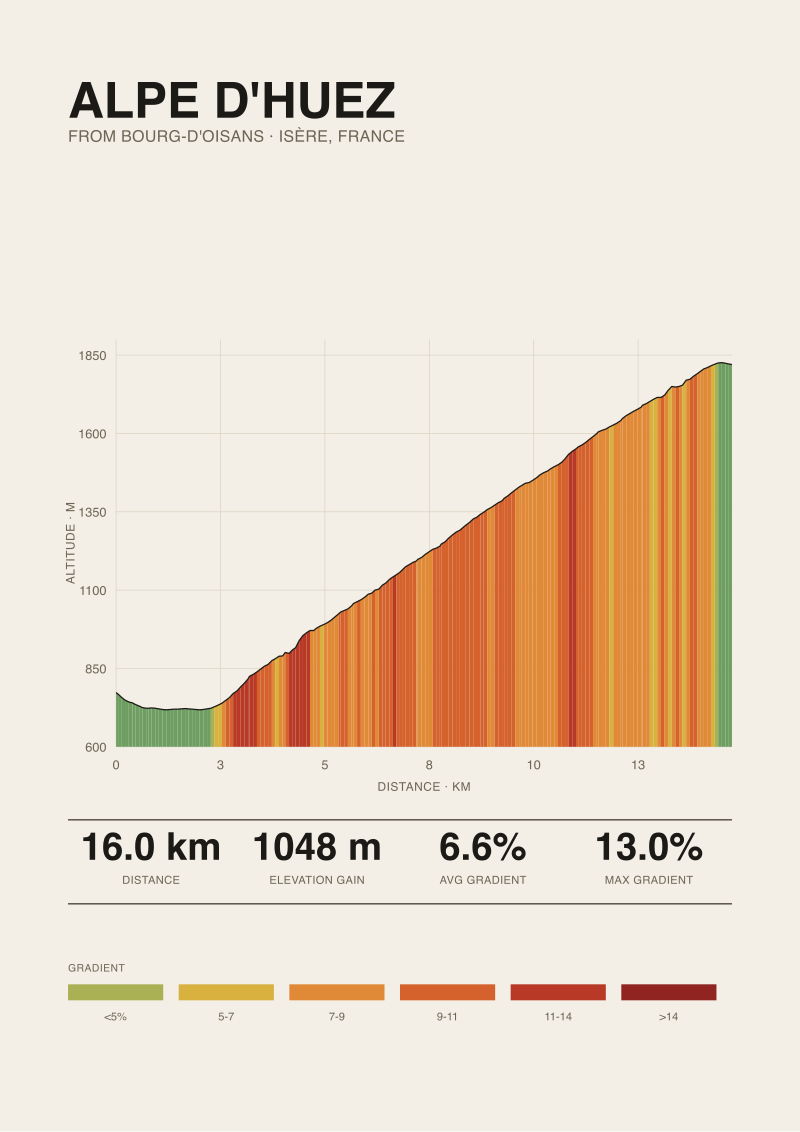 Alpe d'Huez
The print from this article · from €29.95
View the print →
Alpe d'Huez
The print from this article · from €29.95
View the print →
Scenario 3: The Interior Designer Sourcing for a Client
The third composite is professional. A designer is briefing a home office for a client who cycles seriously, has European family, and requested "something to do with cycling, tasteful, no jerseys framed on the wall". The designer has a shortlist of climbs and a shortlist of studios. The question is which combination sits comfortably in a room that already has muted plaster walls, brass hardware, and a mid-century oak desk.
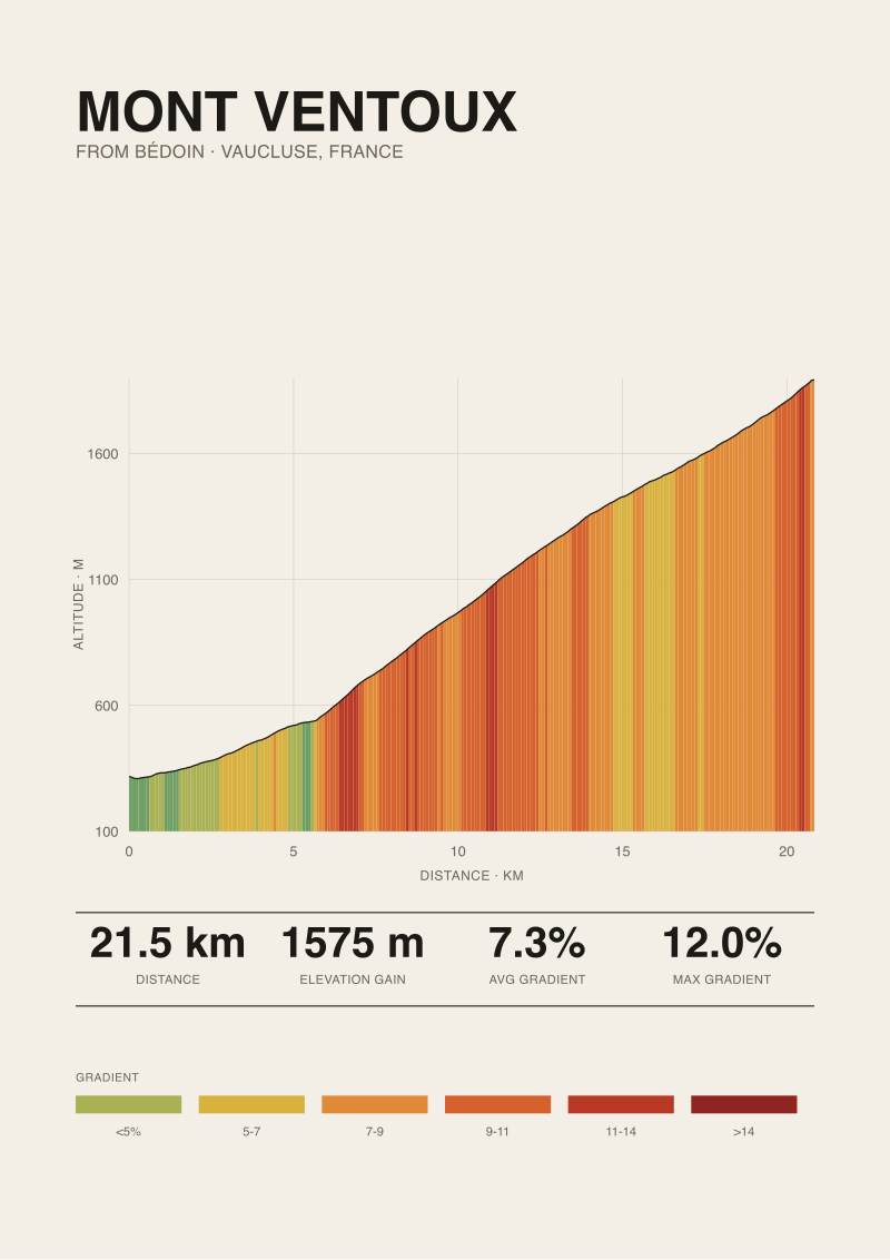
Here, the buyer's math is dimensional. They need to know the print size before they need to know the climb. A 50 × 70 cm portrait format works above a low sideboard; a 30 × 40 cm reads as a study piece pinned near a bookshelf; anything larger competes with the window. Alpe d'Huez, because the climb is tall and short — 1,048 m of gain compressed into just under 16 km — draws well in portrait. The profile has real vertical presence. A climb like Ventoux, gaining more over a longer road, tends to want landscape. This is not an aesthetic preference; it follows from the ratio between distance ridden and altitude climbed.
The designer also asks a question the first two buyers rarely ask: what is the source of the elevation data. A studio that draws from OpenTopoData SRTM 30 m satellite readings will produce a slightly different curve than one drawing from official French road-book figures. Neither is wrong; they measure different things. Satellite elevation captures the underlying terrain at 30-metre resolution and smooths out the very short-range variation a rider actually feels. The published maximum near 13 percent — sourced from climbfinder.com — refers to a specific ramp measured on the road surface itself, and appears as a sharper spike than the SRTM curve resolves. A designer working for a serious client needs to know which method the studio used, so they can explain to the client, if asked, why the peak on the wall reads a certain way.
The third scenario is also where the commercial question becomes cleanest. The designer will pay a premium for a print that will not be recognisable from any other office. That premium buys measurement — not just illustration. If a studio can show its working, the piece stops being a poster and becomes something closer to a small piece of applied cartography. On our own shop, the Alpe d'Huez print is offered with the SRTM 30 m source annotated on the sheet for exactly this reason; the designer needs it, even if the eventual client never reads it.
What All Three Share
Three very different buyers. The rider auditing a memory, the armchair fan compressing two decades of July viewing into a single object, the designer sourcing for a room. What they share is not taste; it is a demand for the print to be answerable for itself.
Each one, in a different vocabulary, is asking the same question: does this poster refer to the actual mountain, or does it refer to other posters of the mountain? A print that references other prints is a decorative object. A print that references the road surface — its 15.97 km, its 1,048 m of gain, its 6.6 percent average, its published 13 percent maximum on the early ramps, its climb from 773 m at Bourg-d'Oisans to 1,820 m at the summit — is a record. The three buyers are willing to pay for the second and quietly bored by the first, even when the first is prettier.
The other shared trait is scale awareness. The rider knows how long they were on the road. The armchair fan knows how long the televised climb takes at race pace. The designer knows how much wall they have. All three, in their own way, are performing a ratio calculation between the climb and the space it will occupy. The illustrator's job is to honour that ratio — not to inflate the mountain, not to shrink it, not to average it into elegance. If the drawing lies about the profile, the buyer will feel it eventually, even if they never articulate why.
Finally, all three share a low tolerance for the word "vintage" when it is used as a mood rather than a discipline. The mid-century French poster tradition was rigorous: type carefully specified, palette limited to what lithography allowed, geometry drawn from the actual subject. A vintage-styled poster that does not respect those constraints reads to all three of these buyers as costume.
Which Scenario Is You
If you have ridden Alpe d'Huez and you are still adjusting your memory of the first ramp against your Strava file — you are Scenario 1. What you want is a print that will not let the memory drift. Look for a studio that marks the 13 percent section correctly and does not round the summit altitude away from 1,820 m for tidiness.
If you have watched twenty Tours and you are trying to compress the aggregate of that viewing into a single object on the wall — you are Scenario 2. What you want is the aesthetic tradition executed with restraint, on a profile that is dramatic enough to carry the illustration without embellishment. Alpe d'Huez, by the numbers, is one of the few climbs that can hold that weight.
If you are sourcing for a room, whether for yourself or for a client, and the print has to sit in a considered space alongside other considered objects — you are Scenario 3. What you want is a studio that will tell you what it measured, at what resolution, from which source, and let the answer inform your framing choice before you argue about the palette.
Rare buyers are two of the three at once. Almost none are all three. The clearer you are about which scenario is doing the work, the easier the piece is to choose — and the longer it will stay on the wall before you notice it again with fresh eyes.
This walkthrough deliberately did not cover a few things. It did not address framing choices — glass versus acrylic, matte width, moulding profile — because those decisions belong to the room rather than to the climb. It did not address multi-print groupings, where an Alpe d'Huez poster sits beside a Galibier or a Croix de Fer on the same wall, because comparative composition is a longer argument than three composites can carry. And it did not address descent profiles, which for Alpe d'Huez are simply the ascent reversed and therefore drawn less often, even though a rider who paid the climb back on the way down sometimes wants both. Each of those is a separate conversation for a separate day at the desk.
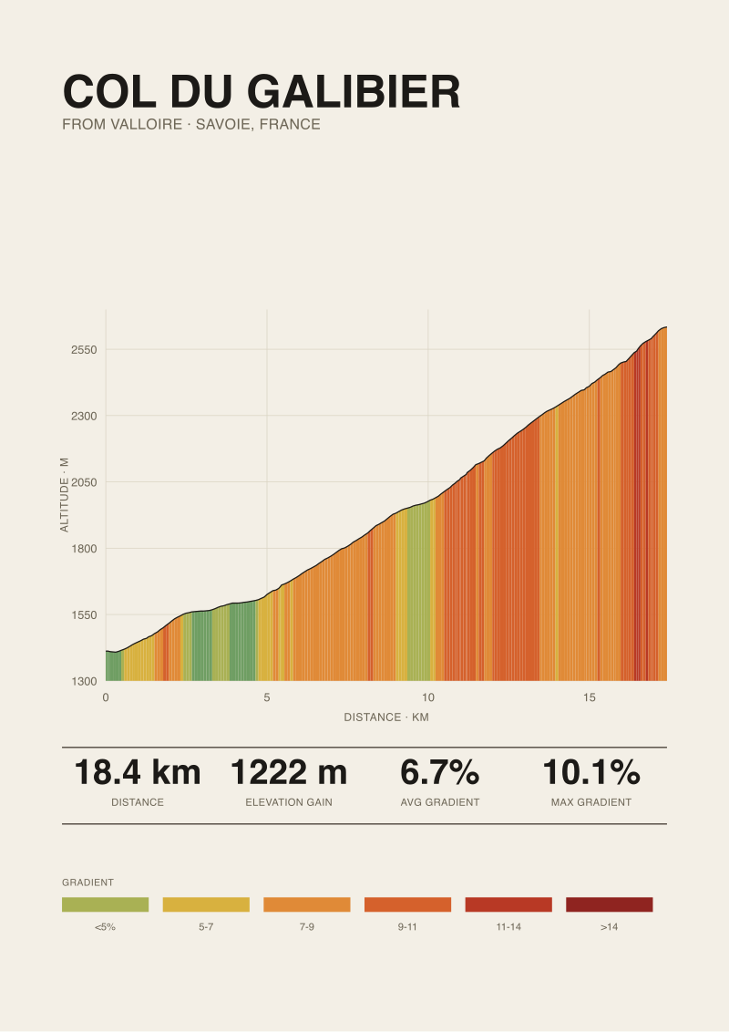 Col du Galibier
The print from this article · from €29.95
View the print →
Col du Galibier
The print from this article · from €29.95
View the print →
From the collection
New climbs and 10% off your first print.
One email now with your code. No noise after.