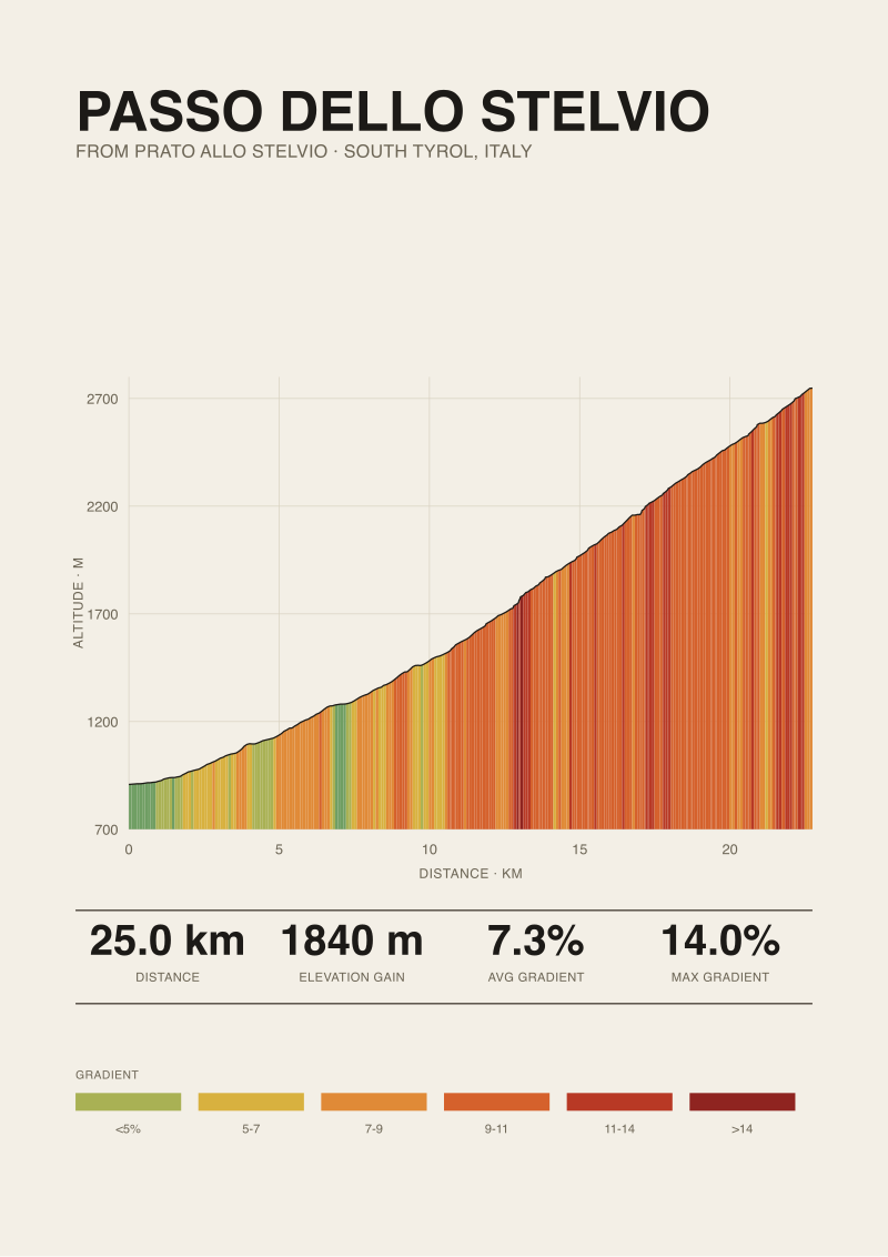
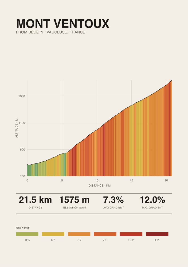
There is a pattern in every conversation about climb categories. Somebody mentions the Stelvio and somebody else mentions Ventoux, and by the third sentence someone has said "they're both HC." Both are, in the Grand Tour classification. Both, measured from Prato allo Stelvio and Bédoin respectively, average exactly 7.3 percent. The Stelvio is 25.04 km and climbs 1,840 metres; Ventoux is 21.51 km and climbs 1,575. The category system compresses that difference into the same letter. It is doing something. It is not doing what most riders think it is.
The Multiplication Trick: How Length × Gradient Became a Rating
Every Grand Tour category — 4, 3, 2, 1, and HC — is ultimately a threshold on the product of two numbers: the length of a climb and its average gradient. The rating is not a measurement of pain, not a measurement of altitude, not a measurement of history. It is a rectangle. Length on one axis, gradient on the other, and the area of that rectangle decides the letter.
This is why the pattern above works. The Stelvio from Prato allo Stelvio is 25.04 km at 7.3 percent. Ventoux from Bédoin is 21.51 km at 7.3 percent. Multiply length by gradient and you get roughly 183 for one and 157 for the other. Both are large enough to blow past whatever the ceiling of Category 1 is in any given race, so both land in HC. The rectangle keeps growing beyond a certain size and the label stops changing.
The multiplication trick has one virtue and one flaw, and they are the same fact. It is symmetrical. A 20-kilometre climb at 6 percent looks, to the rectangle, exactly like a 10-kilometre climb at 12 percent. The rating system treats them as siblings. Anyone who has ridden both knows they are not siblings. They are not even in the same family of suffering. One is a diesel problem. The other is a lactic-acid problem that happens over and over on ramps you cannot sit down through. But the rectangle does not care what shape the rectangle is. It only cares about area.
That indifference to shape is the first thing the category letter hides. The letter tells you the climb is big. It does not tell you *how* the climb is big. And "how" is where the ride actually lives.
The Average Gradient Deception: Why 7.3% Hides Everything That Hurts
The second layer of the rating system, the one implicit in every category calculation, is the average gradient itself — the "percent" that gets quoted in every route book and every café conversation. This number is arithmetically honest and pedagogically useless. It is the total elevation gained divided by the total length ridden. It is the shape of the climb with the shape removed.
Consider the numbers again. The Stelvio from Prato allo Stelvio: 25.04 km, 1,840 metres of gain, average 7.3 percent, published maximum of 14 percent. Ventoux from Bédoin: 21.51 km, 1,575 metres of gain, average 7.3 percent, published maximum of 12 percent. Same average, different maximums, wildly different profiles, and the average tells you none of that. A rider who trains to 7.3 percent as a target intensity and shows up in Prato allo Stelvio will meet a road that rarely lets them settle at exactly 7.3 percent for more than a few hundred metres at a time. Averages are pointwise fictions. They exist as a mathematical operation, not as a section of road you can ride at.
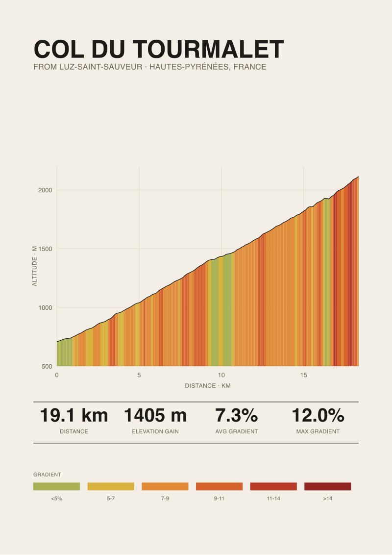
The Tourmalet is the tell. From Luz-Saint-Sauveur, our measurements give it 19.12 km at 7.3 percent, with a published max of 12 percent from climbfinder.com. Three canonical HC climbs — Stelvio, Ventoux, Tourmalet — arriving at the same 7.3 percent average from lengths of 25, 21, and 19 kilometres. If the average were doing serious analytical work, we would expect it to separate these climbs. It cannot. It is descriptively saturated.
There is a diagnostic move that solves this at the individual-climb level: you look at where the steep sections cluster. On Ventoux the hard part is the middle third, through the forest, before the moonscape opens up and the gradient softens fractionally on the exposed summit ramps. On the Stelvio the steepness is metered out in bands across the whole ascent, punctuated by hairpins that give the road a rhythm the profile chart makes visible immediately. The average gradient says nothing about which of these two shapes you are about to ride. The elevation profile — the actual line, drawn from measured points — says everything.
 Passo dello Stelvio
The print from this article · from €29.95
View the print →
Passo dello Stelvio
The print from this article · from €29.95
View the print →
The Published Max Problem: When Road Books and Satellite Data Disagree
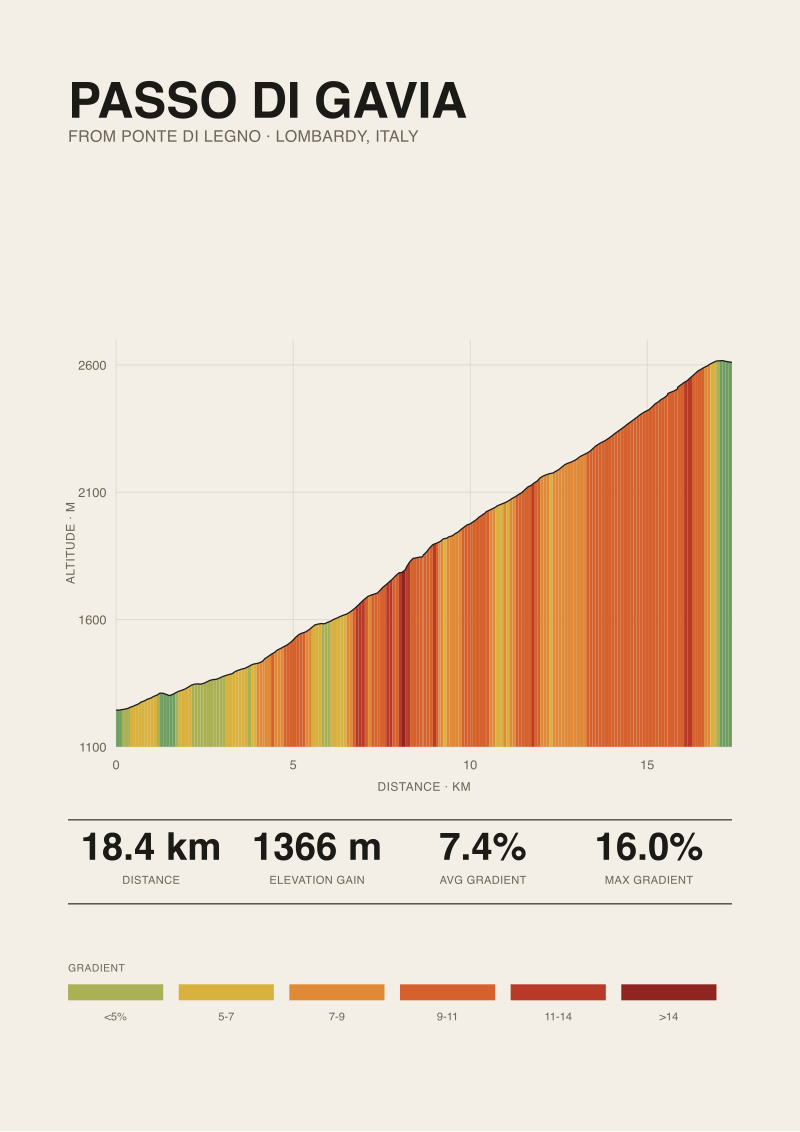
The third layer of the rating conversation is the maximum gradient — the number quoted in signage, road books, and the little roadside markers that inform riders they are about to hit "16%" or "14%". These figures come from published sources: national cycling federations, climb databases, tourism boards. Our own dataset, for the four climbs discussed here, uses climbfinder.com as the source of the published max — 14 percent for the Stelvio, 12 percent for both Ventoux and Tourmalet, 16 percent for the Passo di Gavia from Ponte di Legno.
The published maximum is a claim about the road; the profile is a claim about the mountain, and the two do not always agree.
Our profile data comes from a different source entirely: OpenTopoData SRTM 30-metre elevation, which samples the terrain from satellite radar and interpolates the road as it crosses each cell. A road book measures with a level or a laser at the steepest visible ramp. Satellite data averages elevation over 30-metre cells and does not know where the road switches back or where a ramp shortens across a corner. When you compute a maximum from satellite data, you get a smoothed number — often lower than the published maximum, sometimes materially so.
This gap is not a scandal. It is a definitional difference. Road books answer the question "what is the steepest metre of road I might touch?" Satellite profiles answer the question "what is the steepest 30-metre stretch as reconstructed from radar?" Both are legitimate; neither is wrong. But they produce different numbers, and riders using both will occasionally notice the mismatch and reach for a bad explanation.
The Gavia is the case where this matters most. Published max: 16 percent from Ponte di Legno, per climbfinder.com. Our measured profile gives an average of 7.4 percent across 18.42 km and 1,366 metres of gain. That published 16 percent is real — there are ramps out of the village at the base and above the treeline that hit it — but the average and the ramp live in different arithmetic universes. A category rating built on average gradient will treat the Gavia as a peer of the Stelvio and Ventoux. A rider using the published max as a mental anchor will expect a wall. Both are correct within their own measurement basis, and the two do not have to agree to be useful. They just have to be labelled honestly so the reader knows which one they are reading.
The HC Escape Hatch: What "Beyond Category" Actually Rewards
The fifth category, Hors Catégorie, was introduced in the Tour de France to accommodate climbs the arithmetic of Categories 1–4 could not contain. In the original scheme, categories corresponded to what gear a Citroën 2CV needed to drive up in — fourth for the easiest, first for the hardest. HC meant the car could not do it in any gear. The label survived the car. What it now designates is any climb above the size ceiling of Category 1, which in most Grand Tours is a rectangle roughly equivalent to 15 km at 6 percent, though the exact thresholds vary by race and organiser.
The escape hatch does one thing the rest of the system does not: it stops trying to differentiate at the top. Once a climb crosses the HC line, the label commits no further. This is why the Stelvio (25 km, 7.3 percent, summit 2,748 m), Ventoux (21.5 km, 7.3 percent, summit 1,892 m), Tourmalet (19.1 km, 7.3 percent, summit 2,114 m), and Gavia (18.4 km, 7.4 percent, summit 2,610 m) can all share the same letter and represent genuinely different rides. The rating is not lying. It is refusing to keep talking.
This is arguably the honest part of the system. Below HC, the categories pretend to a granularity they cannot deliver: a Category 2 and a Category 3 climb, in different terrain, in different weather, at different points in a stage, can produce completely different racing dynamics. At HC, the label admits that the rectangle has run out of resolution and the rest of the differentiation belongs to the profile, the altitude, and the day. The Gavia's summit is 2,610 metres; the Tourmalet's is 2,114; that 500-metre altitude gap does more to differentiate the ride than any label can. Category ratings do not include summit altitude. This is another omission the HC label politely refuses to fix.
The category system, in other words, is doing what categories always do. It groups. It sorts. It gives you a fast heuristic for whether a climb belongs in the "hard day" bucket or the "before lunch" bucket. It does not tell you what the climb is. It tells you what pile the climb goes in. If the pile is HC, the pile is very large. Everything from a wooded 19 km at a metronomic seven-and-change to a 25 km monster crossing 2,700 metres of altitude fits in that pile. The label is a wrapper. The road is what you actually meet.
 Mont Ventoux
The print from this article · from €29.95
View the print →
Mont Ventoux
The print from this article · from €29.95
View the print →
So What Do You Actually Do
Read the profile, not the letter. The category rating is a compression, and the compression drops the exact information you need to prepare for the ride: where the steep pitches are, how long the easier middle sections last, whether the summit ramps or plateaus, and how much altitude the road forces you above the treeline. All of this lives in the elevation line, which is public data for every serious climb in Europe. The letter is a filing decision. The line is the mountain.
Compare climbs on shape, not category. When somebody asks whether the Stelvio is harder than Ventoux, the useful answer is not "they're both HC." The useful answer is that the Stelvio is longer by three and a half kilometres and 265 metres of gain, summits eight hundred and fifty metres higher, and offers a rhythm of hairpins the Ventoux does not; that Ventoux front-loads its steepness in the forest section and asks for a specific kind of forest-shade pacing; that the Gavia is shorter and steeper on paper, starts already above 1,200 metres of altitude, and finishes at 2,610 metres where the air is thin enough to matter more than any average gradient suggests. That is a comparison. The letter is a shorthand for a comparison that has already lost most of its content.
If your route planning depends on category letters, replace them with two numbers you can trust: length in kilometres and total elevation gain in metres. Between them, you get the size of the day. Then look at the profile for the shape. That is the whole method. It takes less time than reading three forum threads about whether a climb "feels" HC, and it produces answers you can actually pace to. The category letter was invented for race commissaires to allocate points at the summit. It was never meant to be a training tool, and it certainly was never meant to be a ride-planning tool. Use it for what it was built for, and then walk away from it.
If, after all this, you want to keep the memory of a specific climb — the actual shape of the road, not the letter — the profile itself is the artefact worth having on the wall. That is the studio's whole reason for measuring these things: to draw the mountain the way it actually is, not the way the category says it is. You can find the climbs we've measured in our shop.
From the collection
New climbs and 10% off your first print.
One email now with your code. No noise after.